User Interviews . Affinity Mapping . User Insights . Problem Statements
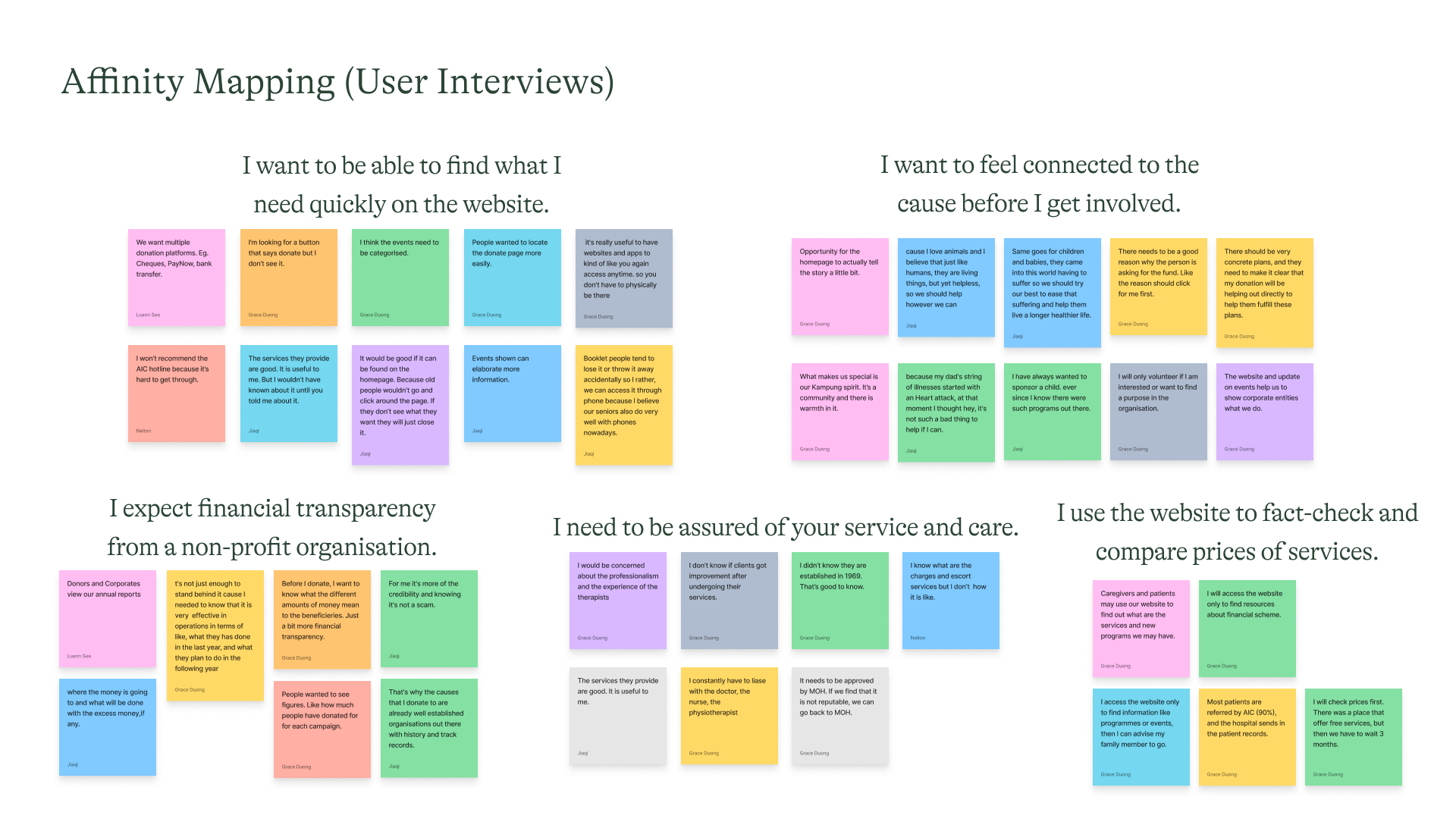
Affinity mapping information gleaned from interviews led us to several insights. Here are the more prominent ones which we believe would be more impactful into solving some important needs and pain points.
Through the interviews, we also discovered that the clients are not the main users. We saw that the main users tend towards two personas -the donors and caregivers.


From the personas, we identified the different problem statements, and then asked some How Might We (HMW) questions. These helped us in our ideation for solutions.
We performed card sorting by grouping pages under categories to better organise them and also renamed some of the pages for better understanding.
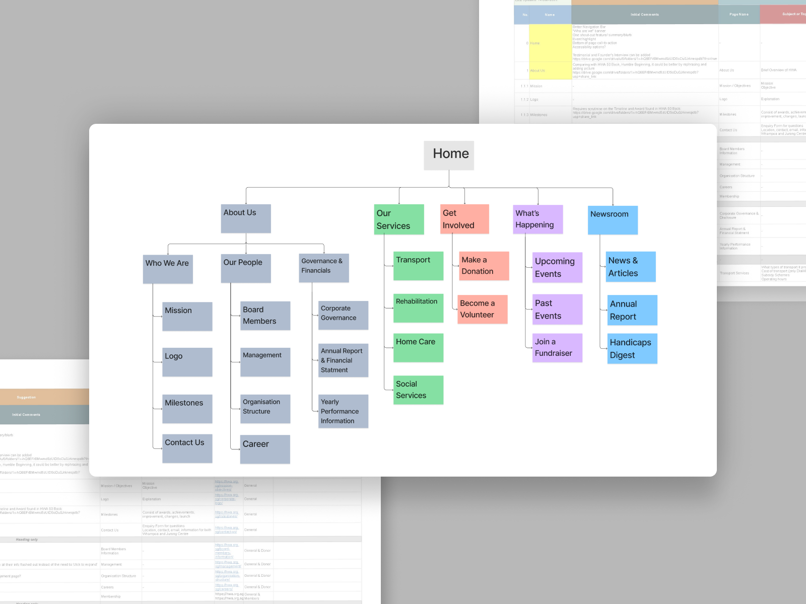
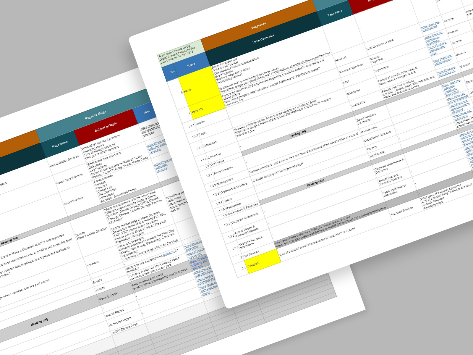
Using the NN Group template, we created a content inventory to audit the current website's content.
Competitive and comparative analysis of the websites of similar organisations was also conducted, contributing to the decisions made here.
Based on Donna's and Cara's needs as donor and caregiver respectively, we worked out 3 different user flows.
They focus on making a donation, checking for services, and looking up events.

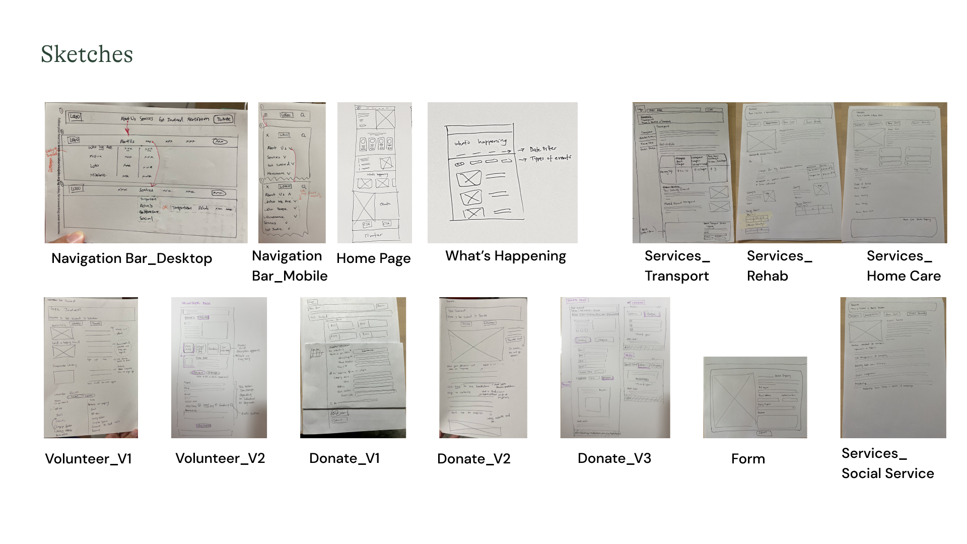
Low-fi sketches were made based on content strategy and information architecture done earlier. From there, improved mid-fi digital wireframes were created, forming the framework.

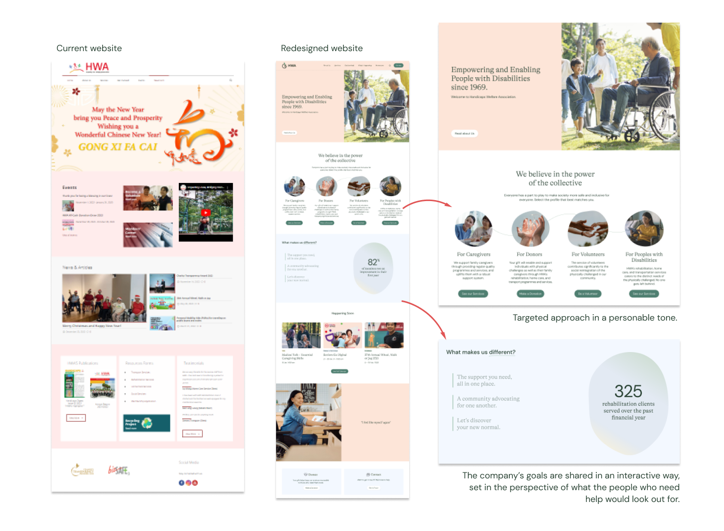
The approach was to convey important or necessary information in a clear and concise way, while maintaining a professional and warm tone, building rapport with users with empathetic storytelling where appropriate.
Text was kept shorter, and breathing spaces introduced. Interactive components are used to engage.
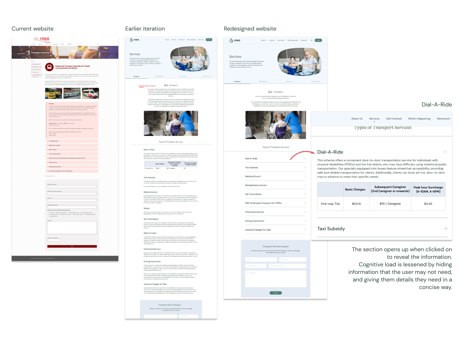
Content was structured for quicker understanding in a visually appealing way. Eg, Dial-A-Ride rates are presented in a table format for quick comprehension.
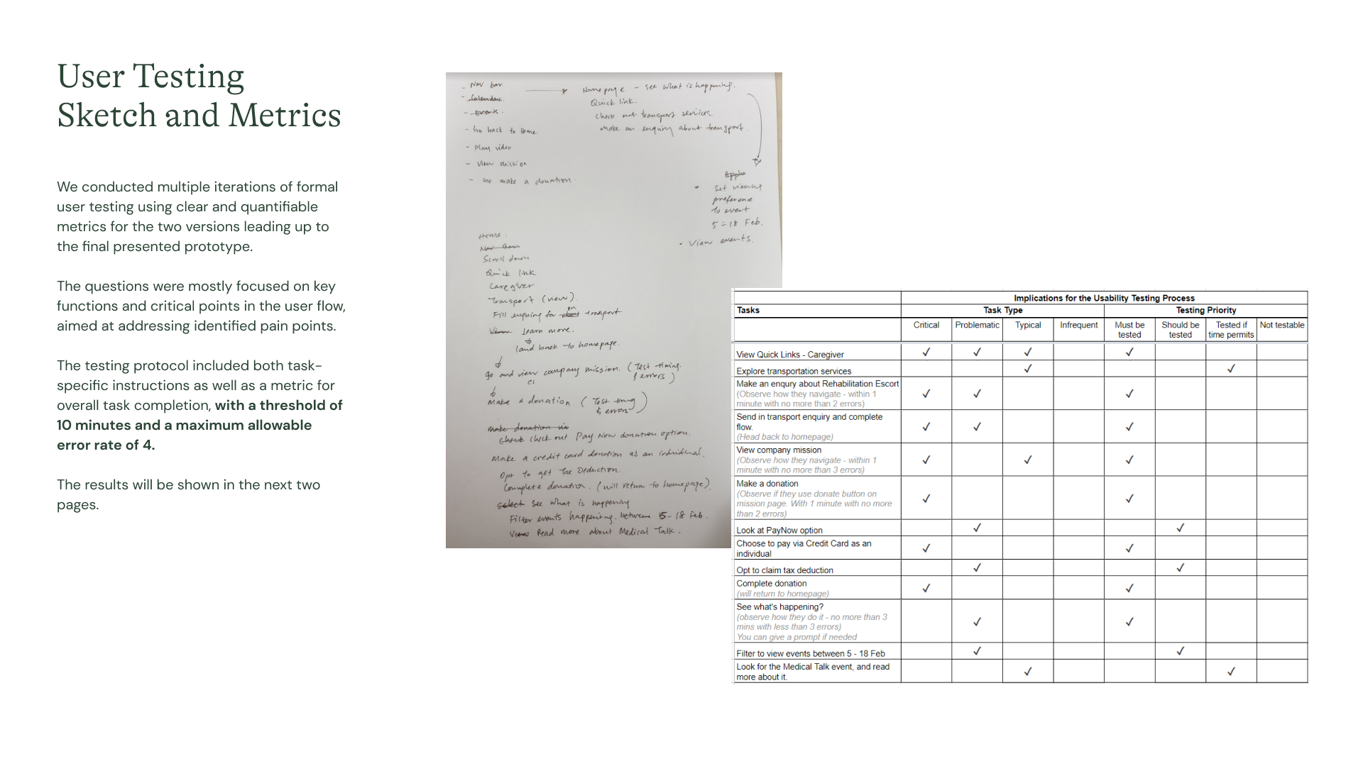
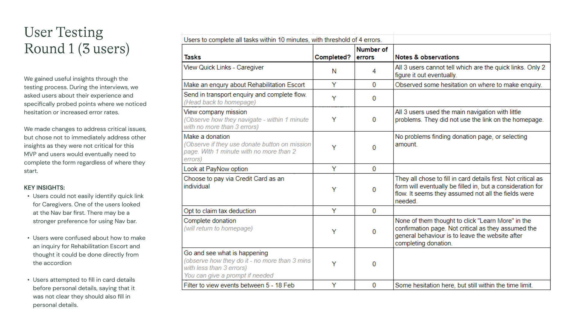
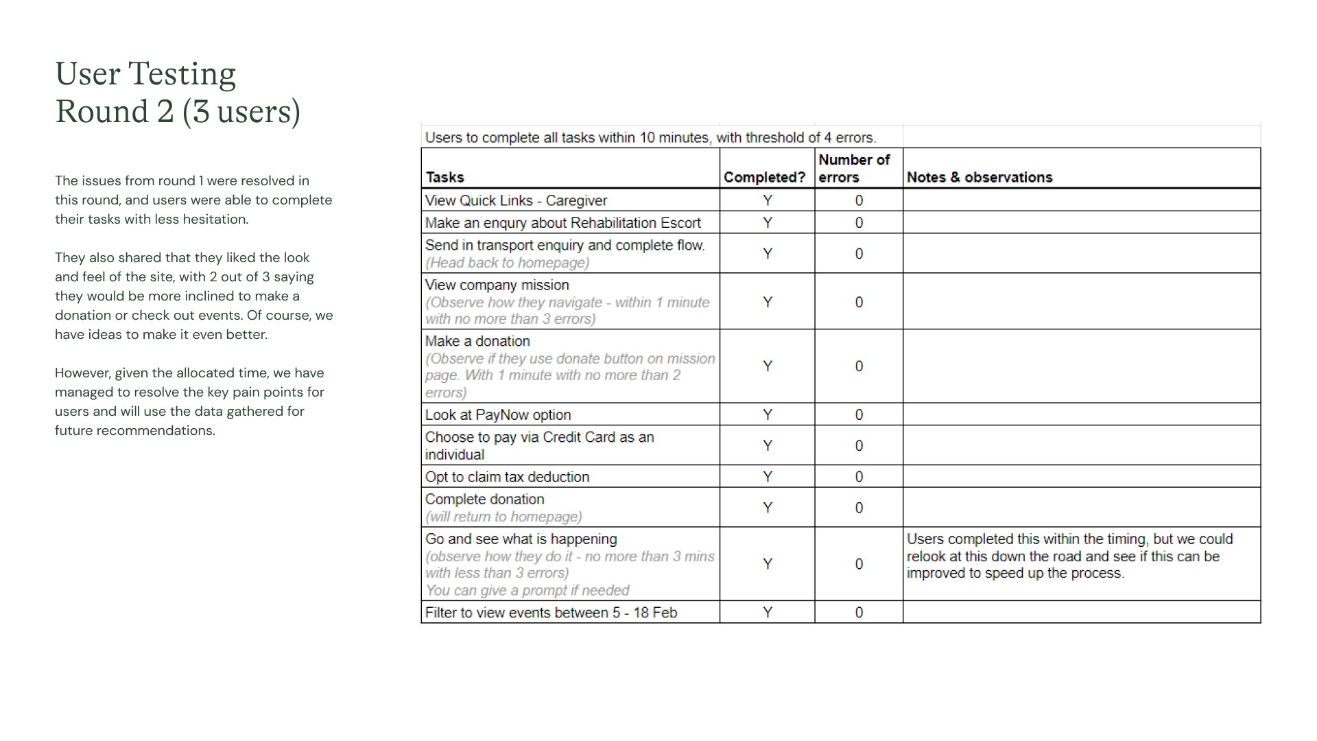
We conducted formal user testing using clear and quantifiable metrics for the two iterations leading up to the final presented prototype. Questions were mostly focused on key functions and critical points in the user flow, aimed at addressing identified pain points. The testing protocol included both task-specific instructions as well as a metric for overall task completion, with a threshold of 10 minutes and a maximum allowable error rate of 4.
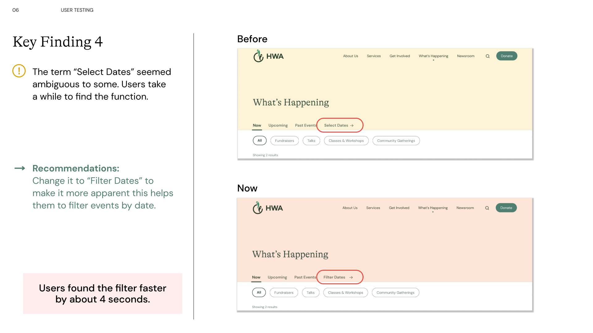
Some key findings and changes are reflected in the 4 slides below.
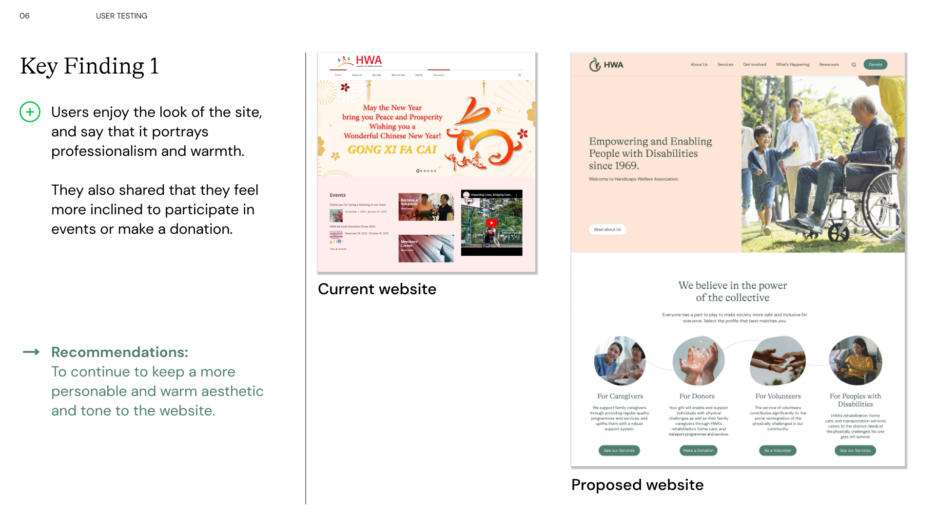
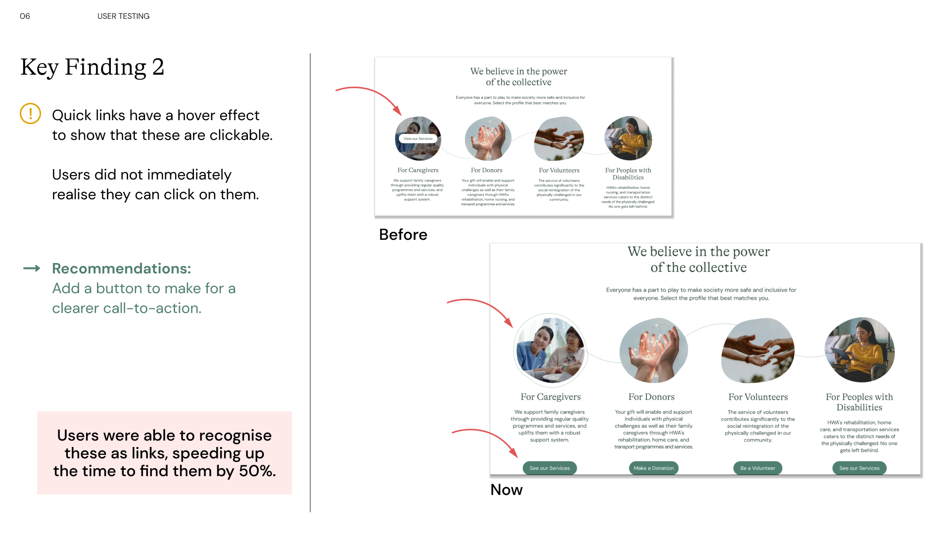
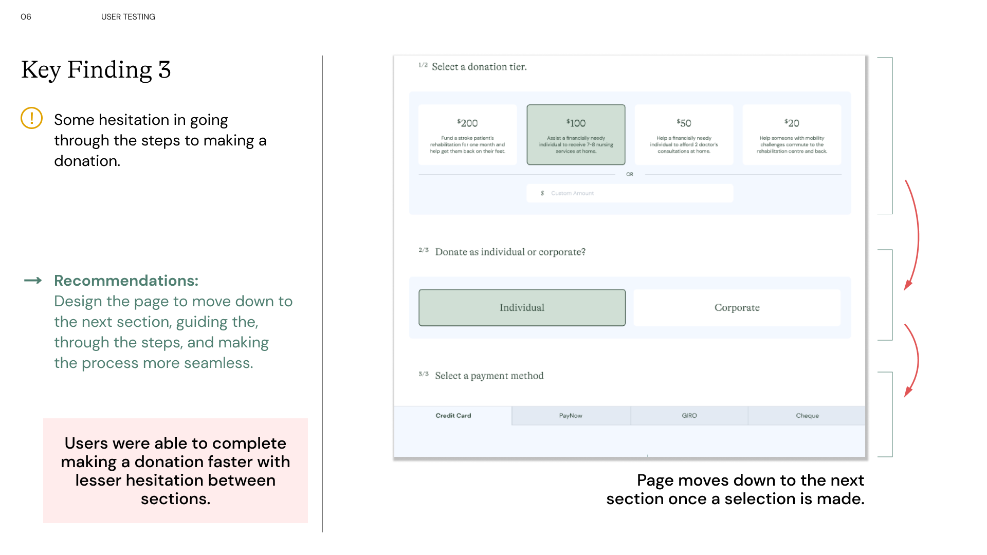
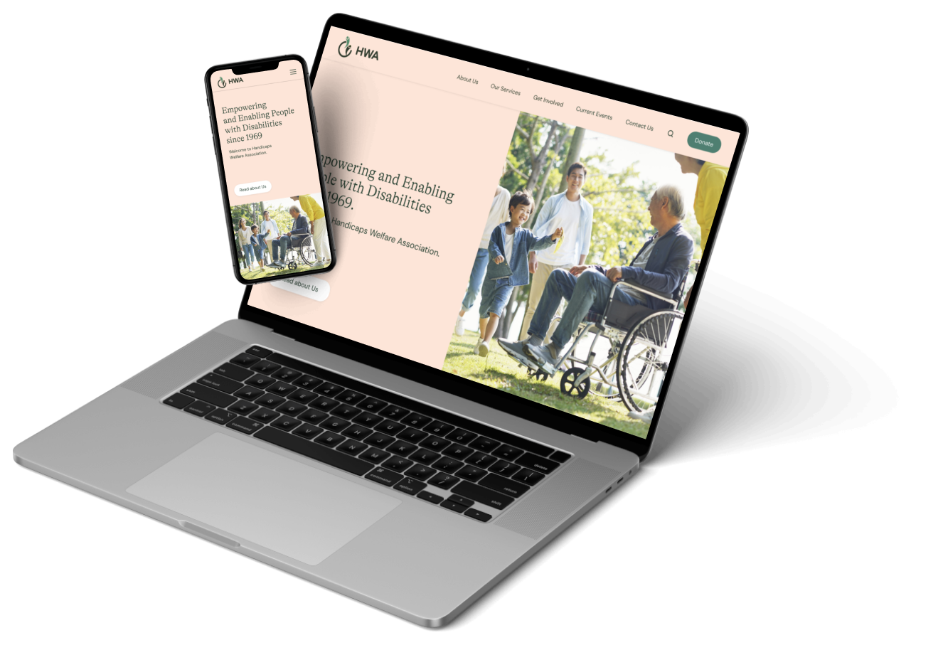
Seen here, are interactions added to engage the user. Different groups of information have been sectioned with breathing spaces incorporated between. Here, you are walked through how a donor might read about HWA's mission and the people they help. They are able to quickly navigate to the donation page through dedicated quick-links. And finally, a donation page that is moves down to the next section once a selection is made to lessen cognitive load, speed up the process, making it easier for the user.
Seen here, are interactions added to engage the user. Different groups of information have been sectioned with breathing spaces incorporated between. Here, you are walked through how a donor might read about HWA's mission and the people they help. They are able to quickly navigate to the donation page through dedicated quick-links. And finally, a donation page that is moves down to the next section once a selection is made to lessen cognitive load, speed up the process, making it easier for the user.
If you like what you see and want to work together, get in touch!
luannux@gmail.com